The difference is subtle... but I like it. It is softer....
Yes.. just a subtle difference. I think I would be happy with either one:)
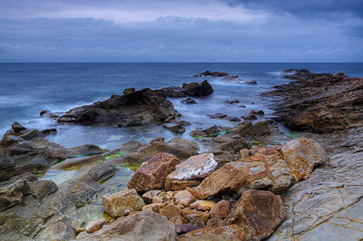
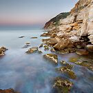
A beautiful seascape, with the orange tones "popping" the blues.I like the first (bottom) one, as I see more definition (due to mid-tone contrast) in it, but they're both beauties.
Post a Comment
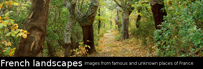
PLACES
HAUTE SAVOIE SAVOIE AIN JURA ARDECHE PROVENCE CORSICA
SPECIAL PLACES
ANNECY PARIS
SUBJECTS
MEDITERRANEAN SEA WATERFALLS LAKES FORESTS RURAL VILLAGES CITIES
SEASONS
SPRINGTIME SUMMER AUTUMN WINTER
MISC
LONG EXPOSURES ABSTRACTS REFLECTIONS HDR
for sale on :
REDBUBBLE
Mark Alan Meader
Mark Paulda
Michelle Basic Hendry


3 comments :
The difference is subtle... but I like it. It is softer....
Yes.. just a subtle difference. I think I would be happy with either one:)
A beautiful seascape, with the orange tones "popping" the blues.
I like the first (bottom) one, as I see more definition (due to mid-tone contrast) in it, but they're both beauties.
Post a Comment